JODECI THE COPYWRITER


CLIMBING THE LADDER
When I learned the mission of the new Hustle Hard Scholarship Fund – help minority students attend Florida International University – I was 100% 'bout it. And when its founder pegged me to design the logo? I was 100% honored. I knew it would have to be clean and profesh to attract donors. But I also wanted it to excite 16 to 20-somethings. Because, at the end of the day, this fund is for them.

BRAND IDENTITY


GETTING STARTED
I began sketching on a Burger King to-go bag. (Hey, you can't help when inspiration strikes!) Out of quite a few *ahem* rustic drawings emerged the ladder. It was a fitting visual metaphor: Hustle Hard is the ladder underserved students can climb to success.
STICKING TO THE FIU SCRIPT – SORT OF
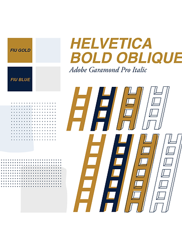
We needed to make sure people had visual cues that this was a bonafide FIU initiative – without being super obvious about it. That meant using FIU's official colors and fonts. Luckily, Helvetica was perfect for making the ladder come to life.
I then created additional elements to liven things up a bit: A new light gray and blue, assorted ladder graphics, hand-drawn and offset color effects, and pattern overlays gave the identity depth when layered.

REACHING FOR MORE
Naturally, my copywriter side never stays dormant for long. The "Climb Higher" tagline is a call to action for future recipients: Use your scholarships as the momentum to reach beyond your potential.
"I CAN'T THANK YOU ENOUGH!"


