JODECI THE COPYWRITER
BRAND DESIGN
FIRST HOLISTIC WELLNESS
What does it take to re-build a brand from the roots up? Time. The journey of evolving First Holistic Wellness started in 2022 with a fairly innocuous question: "What would you do with this logo?"
My two cents turned into a longstanding relationship with this wellness one-stop shop. Over time, my brand strategy and creative work defined their voice, refined their identity, and helped clarify company structure. All in an effort to better reach customers looking to lead fuller, more whole lives.

FINDING A VOICE FOR
FIRST HOLISTIC WELLNESS
My top priority: Give First Holistic Wellness the tools to clearly and confidently talk about themselves. So, we laid the foundation to build a brand house.
I started with questions like, "What does wholeness mean? Why does it matter?" Their team would dig deep. I'd challenge them to dig even deeper. This process helped me synthesize who they are – mission, vision, values, etc. – and what they sounded like:
A compassionate, slightly off-beat personality that knows just what you need to feel well and whole. (Like your favorite aunt whose mystery tea soothes your stomachache.)
VOICE
BRAND ATTRIBUTES
PILLARS
VALUE PROPOSITION
REASONS TO BELIEVE
MISSION
VISION & PURPOSE
VALUES

A VISUAL IDENTITY SHAPED BY BALANCE
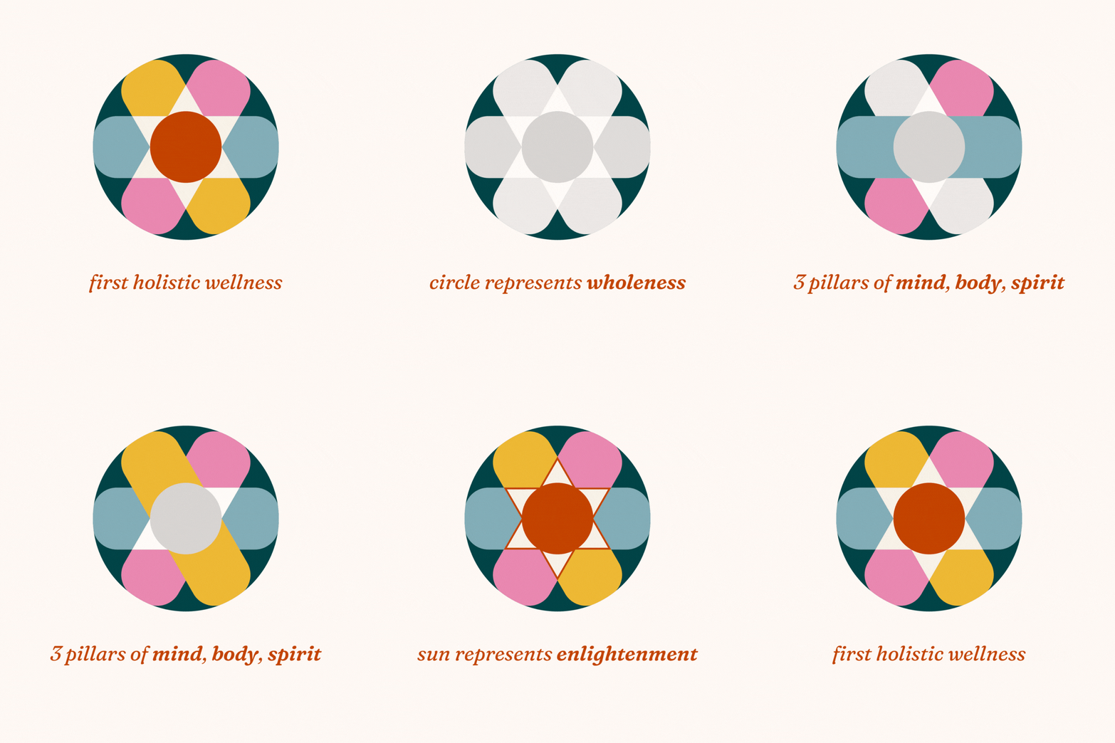
After establishing First Holistic Wellness's new voice, I created a visual identity that reflected their brand attributes – welcoming, quirky, energetic – while also symbolizing the idea of "whole."
I found inspiration in mandalas and badges; imbued and overlapped elements with meaning; and created a palette full of rich, vibrant colors. I also opted for a serif typeface that could flex between feeling serious or playful when needed.
A NEW, WELCOMING
SPACE FOR WELLNESS
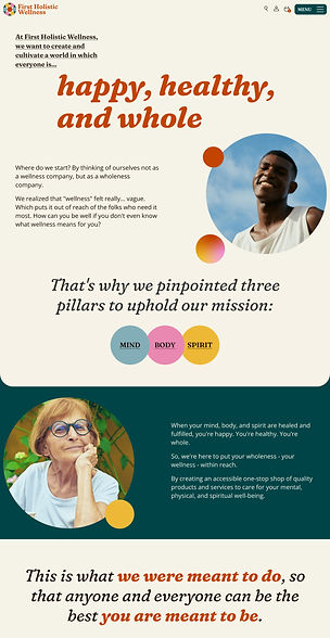
Building FHW's brand identity culminated in a brand-new website that I wrote and designed in its entirety, creating a space meant to make wellness feel accessible – and show what feeling whole feels like.
I pulled in soft elements like gradients and rounded shapes. Wrote compassionate, conversational copy. Handpicked images that reflected their diverse consumer base. And even designed the animated scroll-over elements.



THE FIRST HOLISTIC BRAND ON DISPLAY
As a one-stop wellness shop, First Holistic Wellness also developed their own supplement brand, OrthoFirst. I was tasked with bringing it into the visual FHW fold.
So I created a colorful label system – pulling from the rounded rectangle motifs in their visual identity – that could flex across their future supplement products.
My mission was to design a visual hierarchy that prioritized product clarity, which I greatly considered in the design of the OrthoFirst wordmark and the use of the FHW icon.